Introduction
The Route Report Tools are a key tool available to NPMRDS users. Saved routes can be analyzed using a variety of visualizations to provide at-a-glance or in depth performance measures. The tools allow the addition or removal of multiple routes and visualizations along with the selection of a variety of impactful color schemes. Below, the tools' use will be described.
Accessing the Route Report Tools
The Route Report Tools are primarily accessed via two methods: running one of the standard reports found on the Home page, or accessing Folders, mousing over the "Add New" button and selecting "Reports" from the drop down.

Accessing via the "Add New" menu.
Functions of the Top Right Panel
The Top Right Panel provides the ability to save your report and save your report as a template. Saved reports and templates will be listed in the Folder you have selected to save them to. Additionally, you can hide the controls by pressing on the "Hide Controls" button.

Functions of The Left Side Panel
The Left Side Panel provides five sections: Controls, Routes, Stations, Colors, and Graphs. Routes, Stations, and Graphs have a + or - symbol that will expand or collapse that section. The arrow next to Colors and Graphs allows visualizations to be added to the report and the color scheme to be changed.

Adding a Saved Route
Users have to add routes to the report to begin their construction of the report. Clicking on the "Routes" button will open a dialog window that allows for saved routes to be searched for either by text search or scrolling. Clicking on a route will add it to the report. The "Folders" button next to "Routes" will allow the user to switch between the available folders where routes may be saved.

Once a route has been added to the Routes section, they can be removed by clicking on the "-" or duplicated by clicking on the "+" next to their name in the routes list.
Editing Route Information
Once the desired route(s) have been added to the report, the route information can be edited to suit the type of analysis desired. For example, the year, month, or peak times can be changed. This can be accessed by clicking on the route in the routes list. By default, the route controls panel will be opened in "Simple" view mode. This allows the user to change the year, month, select a peak or peaks, and change the route's color in the list and visualizations.

In order to access more granular controls, click the "Simple" button, switching to "Advanced" mode. This will provide multiple user adjustable options:
- Route Name
- Start and End Date
- Start and End Time
- Peak and Weekday Selectors
- Data Resolution
- Data Vehicle Type
- Raw NPMRDS Data Download
- Data Overrides
- Route Color
The advanced panel is necessary for more in-depth, granular analysis.

Changing Color Schemes
The "Colors" section will allow the user to change the color scheme for any added visualizations. It can be opened by clicking on the arrow to the right of it. There are three types of color schemes: Diverging, Sequential, and Single Hue. Clicking on each will present a variety of color schemes that can be used to improve the legibility of added visualizations.

Adding Graphs
The "Graphs" section is the heart of the Route Report Tools, allowing a wide variety of visualizations to be added in order to perform different sorts of analyses. The graphs menu can be opened by clicking on the arrow to the right of it. This will open up the panel showing the following categories of visualizations:
- Line Graphs
- Bar Graphs
- Maps
- Tables
- HDS Graphs
Clicking on any of these will add them to the report. Once added, they can be dynamically resized and moved around to suit the user's needs. Each graph added has multiple tools in its top right allowing for the user to turn on and off the graph, add a message box describing its content, save the displayed data as a .png file, duplicate the graph, or remove the graph as needed. Clicking on the border of the graph window will allow it to be moved and resized.

Introduction
This document aims to provide the user with information on how to get the most from the graphs available in the Route Report Tools through formatting. Formatting provides an easy to read analysis of the route information. When formatting a report, users can move and adjust the size of graphs, maps, and tables, showing a comparisons between data. Details on how to add graphs can be found in the Using the Route Report Tools (Basic) document. The types of graphs available are described in the Types of Graphs document.
Graph Controls
Each graph offers different controls accessed via drop down menus below the graph's name box. The most common, available for most types of graphs, are the "Routes" and "Display Data" drop downs. These allow the selection of the route the graph will display data for and the type of data to display, respectively. Not all graphs have the ability to change data. Some graphs offer a "Display Data 2" or "Comparison" option allowing for the graph to display additional data types or a comparison of one route to another. Additionally, some graphs allow the data resolution to be selected (e.g., 5-minute epoch or weekday). Clicking on any of these drop down menus will display the list of options allowing reports to provide a wide variety of data visualizations. When making changes to the graph controls, remember to save them using the graph's save feature.


- Reverse Colors: This toggles if colors associated with values are in the reverse order of what is shown.
- Color Range Length: Sets the number of colors to be used in the visualization; some graph types do not allow this function.
- Diverging color style
- Sequential color style
- Single Hue color style


Graph Names
When a graph is added, its default name is the corresponding graph type (e.g., Selecting a "Route Bar Graph" will be titled "Route Bar Graph"). The name of any graph can be changed by clicking on the text and editing it. Remember to save your changes. Naming graphs is important to conveying what the report is trying to analyze. Clear names enhance the usability of a report.

Viewing Graph Data in Reports
Graph data can be viewed, but not edited in the report view. Graph names will be displayed along with any notes added.
Introduction
There are many types of graphs available in the NPMRDS toolset. Mixing and matching graph types for different data types and at different resolutions or times can provide an in-depth analysis of any given route. The graph types are described below.
Line Graphs
Route Line Graph
The Route Line Graph shows data for each route in the routes panel and is an excellent option for comparing different routes or different time periods for the same route. The Route Line Graph by default shows speed but can be changed using the graph controls. The X-axis is controlled by the maximum.

Bar Graphs
Bar Graph Summary
Bar Graph Summary shows a sum or average depending on which data type is selected. There are no data resolution controls. By default all routes are selected to be shown in a Bar Graph Summary but routes can be removed using the routes control.

Experiential Travel Time
Coming Soon
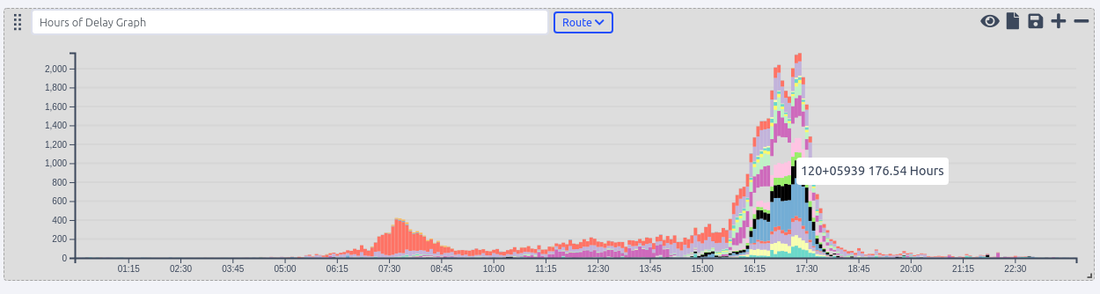
Hours of Delay Graph
The Hours of delay graph shows the vehicle hours of delay measure as a stacked bar graph for each TMC on a defined route. The graph controls allow for the selection of the route to be displayed.
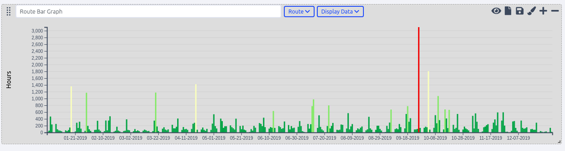
Route Bar Graph
The Route Bar Graph displays a single data type for a single selected route. It's best used to analyze data over time visually.
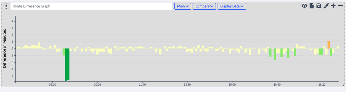
Route Difference Graph
The Route Difference Graph is used to compare one route directly with another, over time. The graph controls require the selection of the main route and a comparison route.
Stacked Transcom Graph
Coming Soon
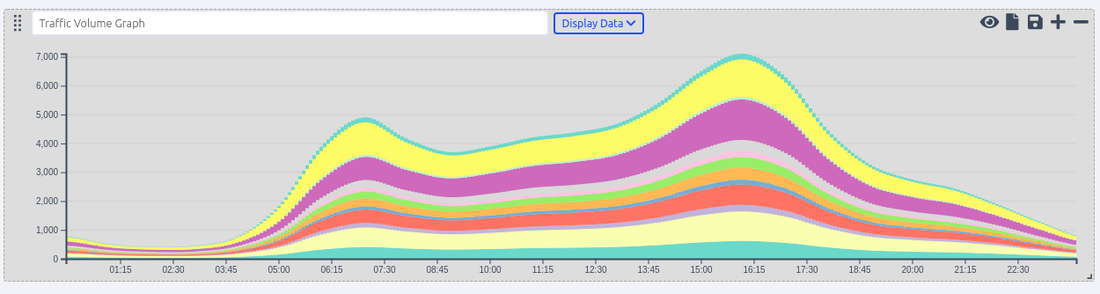
Traffic Volume Graph
The traffic volume graph shows Annual Average Daily Traffic (AADT) or Vehicle Miles Traveled for a single route, displayed as a stacked bar graph for each TMC on the selected route.
Maps
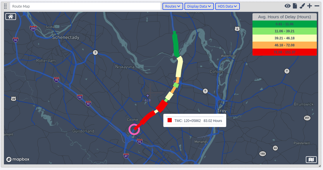
Route Map
The Route Map displays selected routes on a map. A circle indicates the start of a route. TMCs are shown in alternating width to easily identify the differences in segmentation. Different data types can be selected for use, displaying them on the map.
Grid Graphs
TMC Difference Grid
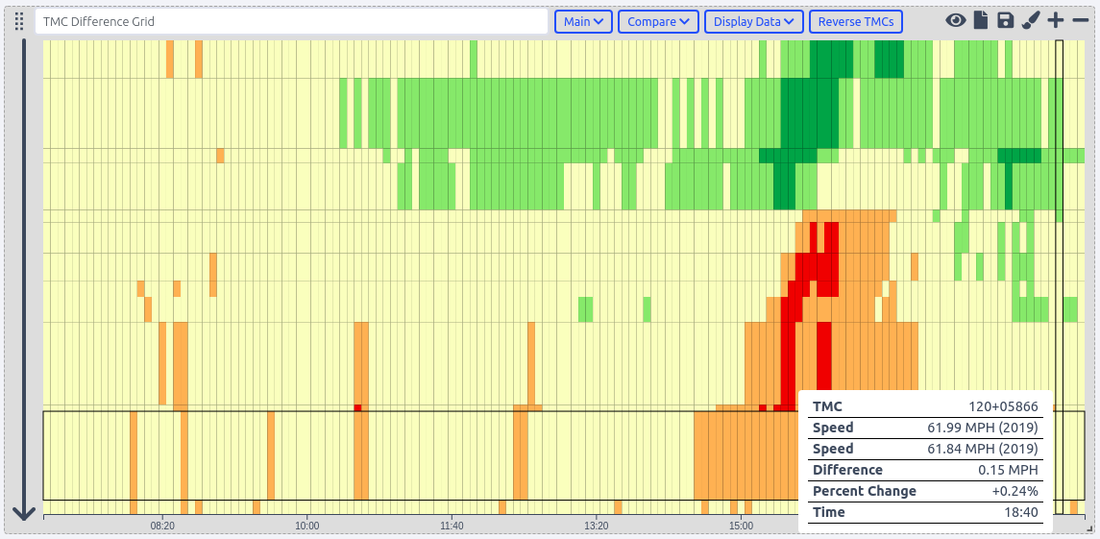
The TMC Difference Graph has the same spatial and temporal features as the TMC Grid Graph, but it compares two routes which use the same TMCs. Colors are used to visualize the difference between both routes for a selected data type. This graph type works best with one route at different time scales. Below shows a comparison of speed on Route 87 North in January 2019 compared to the average speed for the full year of 2019. The end of the route has a slight slowdown in the PM peak, while the start of the route has a slight increase in speed from mid-day through the PM peak.
TMC Grid Graph
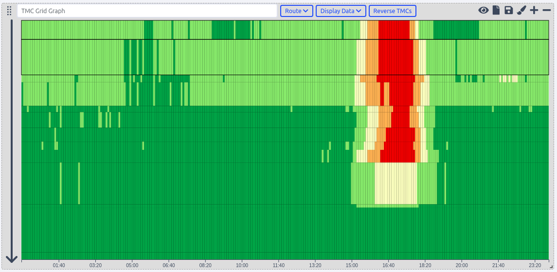
The TMC Grid Graph can be intimidating at first glance. Its display has both spatial and temporal characteristics. TMCs for a selected route are displayed from start to end, top to bottom, and in time, from left to right. The length of the TMCs are conveyed visually by their length from top to bottom on the Grid Graph. The arrow on the left of the graph indicates the direction of flow of traffic through the route. Color is used to visualize the selected data type.
Tables
Route Compare Component
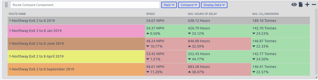
The Route Compare Table shows data types as columns, offering a comparison of all included routes, against the route selected as the "Main" route for comparison. Multiple routes and data types can be added to the graph. Each route will be displayed using the colors selected in the Route Report Tools Controls.
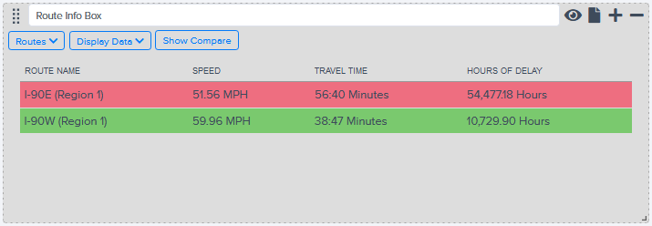
Route Info Box
The Route Info Box is a table that displays selected data types for each selected route. Multiple routes can be added along with multiple data types. Additionally, the Route Info Box can display a comparison of data types between multiple routes.
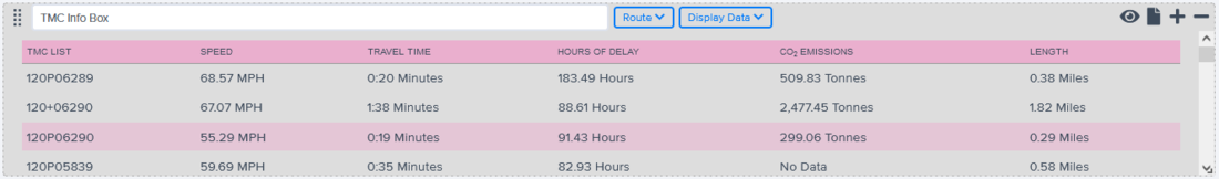
TMC Info Box
The TMC Info Box is a table that displays selected data types for each TMC on the selected route. Multiple routes can be added along with multiple data types.
Transcom Events Chart
Coming Soon
HDS Graph
HDS Bar Graph
Coming Soon
HDS Line Graph
Coming Soon
Report view makes it possible to make actionable reports from raw NPMRDS data and the following measures, the following data measures can be used to compare different corridors with one another or the same corridor over time to monitor performance
Basic Measures
Travel Time
Units: Seconds
Data sources: NPMRDS
Description: The travel time as reported by NPMRDS data, which is the aggregate average of all vehicles traversing that road segment during the 5 minute epoch.
Speed
Units: Miles Per Hour (mph)
Data sources: NPMRDS
Description: The speed is derived by dividing the travel time by length.
Data Quality
Units: % Reporting
Data sources: NPMRDS, TMC AADT, Emissions Table
Description: The % TMC epochs reporting.
Congestion Measures
Hours of Delay
Units: Vehicle Hours
Data sources: NPMRDS, TMC AADT
Description: Delay is the extra amount of time spent in congested conditions defined by speed thresholds that are lower than a normal delay threshold. For the purposes of this rule, the speed threshold is 20 miles per hour or 60 percent of the posted speed limit, whichever is greater. This measure is summed from the start period to the end period of route analysis.
Avg Hours of Delay
Units: Vehicle Hours
Data sources: NPMRDS, TMC AADT
Description: Delay is the extra amount of time spent in congested conditions defined by speed thresholds that are lower than a normal delay threshold. For the purposes of this rule, the speed threshold is 20 miles per hour or 60 percent of the posted speed limit, whichever is greater. This measure is averaged from the start period to the end period of route analysis.
CO2 Emission
Units: Metric Tonnes
Data sources: NPMRDS, TMC AADT, Emissions Table
Description: All Vehicles CO² emissions, summed for time period.
Avg CO2 Emissions
Units: Metric Tonnes
Data sources: NPMRDS, TMC AADT, Emissions Table
Description: All Vehicles CO² emissions, averaged for each time segment by resolution.
Reliability / Index Measures
Traditionally reliability measures have strict bounds on their calculation, they are often used as monthly or annual measure to understand the variability of travel times on corridors. However to make them work with out flexible set of reporting tools you can use them for much shorter time periods for example calculating the planning time index for every 5 minutes period
Freeflow
Units: Miles per Hour
Data sources: NPMRDS
Description: The freeflow measure is the only measure that doesn't depend on the begin and end time of your route selection and only references the year. The freeflow is calculated separately using data for an entire year and will always return the same value for all resolutions for a given year.Measure Equation: 85th percentile of off-peak travel speeds.
Measure Time Periods: Off-peak periods Monday through Friday, 9am to 4pm and 7pm to 10pm, as well as Saturday and Sunday 6am to 10pm
Buffer Time Index
Units: None / Ratio
Data sources: NPMRDS
Description: Expresses the amount of extra "buffer" time needed to be on-time 95 percent of the time (late one day per month). Indexing the measure provides a time and distance neutral measure, but the actual minute values could be used by an individual traveler for a particular trip length. The index is calculated for each road segment and a weighted average is calculated using vehicle-miles of travel as the weighting factor.
Measure Equation: (95th percentile travel time - average travel time) / average travel time)
Planning Time Index
Units: None / Ratio
Data sources: NPMRDS
Description: It is used as a supplemental measure for reliability. Because reliability is related to the distribution of travel rates, the 95th percentile indicates an excessively high travel rate, one that only five percent of all travel rates exceed for the time period under consideration.
Measure Equation: (95th percentile travel time) / 50th percentile travel time)
Misery Index
Units: None / Ratio
Data sources: NPMRDS
Measure Equation: (97th percentile travel time) / 50th percentile travel time)
Travel Time Index
Units: None / Ratio
Data sources: NPMRDS
Measure Equation: (Average travel time / 50th percentile travel time)
95th Percentile
Units: Seconds
Data sources: NPMRDS
Measure Equation: 95th percentile travel time for all reporting time periods in the report.
97th Percentile
Units: Seconds
Data sources: NPMRDS
Measure Equation: 97th percentile travel time for all reporting time periods in the report.